
When it comes to diy home upgrades, few projects have the power to change a space as instantly and effectively as painting. But it’s not just about how a room looks, .it’s about how it makes you feel. The right colors can elevate your mood, reduce stress, and create a welcoming, positive environment. These interior color tips are here to help you infuse happiness into every corner of your home.
Why Color Affects Mood
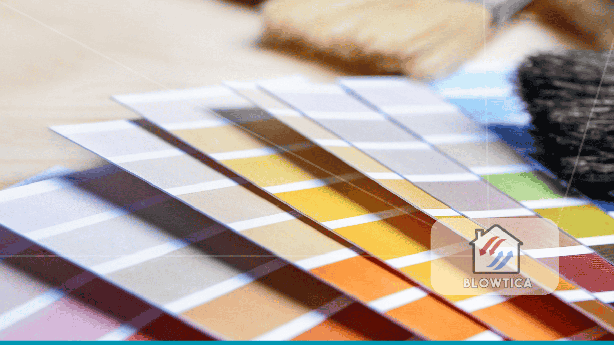
Colors have a profound psychological effect on us. Bright yellows evoke cheerfulness and energy, while soft blues promote tranquility and focus. This isn’t just opinion, it’s supported by years of psychological studies and practical design experience. When considering interior color tips, think beyond the paint chip. Focus on emotional resonance: how you want to feel and function in a space.
1. Assess the Natural and Artificial Light
Before choosing colors, examine the lighting in each room. Natural light changes throughout the day and can dramatically shift the appearance of a shade. Artificial light can also alter tones or LEDs often cast cool light, while incandescent bulbs give off a warm glow.
Tip: Apply sample patches and observe them in both daylight and evening light. This helps you avoid surprises once the paint dries.
2. Choose an Uplifting Base Palette
For a home that radiates positivity, begin with a light, cheerful foundation. Soft whites with creamy undertones, gentle pastels, or warm neutrals can all create a sunny, open feeling.
Recommended Shades:
- Creamy White
- Buttery Beige
- Warm Apricot
These foundational tones can make a space feel more expansive and emotionally inviting.
3. Use Energizing Colors Strategically
Bright or saturated colors work best when used with intention. Incorporate them in rooms where energy and interaction are key, such as the kitchen, home office, or entryway.
Placement Ideas:
- Bold teal on a kitchen backsplash
- Terracotta in a home gym
- Mustard yellow on a front door
Keep strong colors in areas where you want to stimulate conversation or activity, and balance them with neutral backgrounds.
4. Create Calm Zones with Muted Tones
For rooms meant for rest and reflection, such as bedrooms and reading nooks, go for cool, muted hues. These colors help slow your heart rate and calm the mind.
Calming Combinations:
- Sage Green + Soft Beige
- Powder Blue + Ivory
- Lavender + Light Taupe
Use natural materials and soft fabrics to enhance the soothing effect.
5. Divide Open Spaces Using Color Zoning
Open-concept homes are beautiful but can lack visual structure. Use color zoning to designate different areas without physical dividers. For example, paint the dining area a richer shade than the living room to create a subtle transition.
This technique is especially helpful in small apartments where space has to serve multiple functions.
6. Don’t Overlook the Ceiling
The ceiling is often forgotten in design plans, but it has a huge impact on a room’s atmosphere. One of the most overlooked interior color tips is to treat the ceiling as a fifth wall rather than an afterthought. The right ceiling color can dramatically influence how a space feels—both in terms of height and mood.
For instance, painting the ceiling a soft, light hue—such as pale blue, creamy white, or warm beige—can visually lift the ceiling and make the entire room feel more spacious and airy. This is especially helpful in rooms with lower ceilings or limited natural light. On the other hand, using a darker tone like navy, charcoal, or deep green on the ceiling can create a sense of intimacy and coziness, anchoring the room and adding depth.
These subtle yet powerful interior color tips can help balance proportions, define the atmosphere, and elevate the overall design. When planning a room makeover, don’t forget to look up—because the ceiling holds as much design potential as any wall or floor.
Ideas for Ceilings:
- Pale yellow for a sunroom
- Matte navy for a study
- Blush pink for a walk-in closet
A painted ceiling can be an unexpected and delightful feature.
7. Simple DIY Home Upgrades with Color
You don’t need a full renovation to add joy to your space. Some of the most effective diy home upgrades are also the most budget-friendly:
- Paint interior doors a cheerful color like coral or mint.
- Use color-blocking on a feature wall.
- Update drawer interiors or cabinet backs with patterned paint or peel-and-stick designs.
These upgrades allow you to experiment and personalize your space with minimal risk.
8. Try a Monochrome Palette to Elevate Mood
A monochrome color scheme or different shades of the same hue can offer sophistication and serenity. This design approach creates harmony and makes a room feel more curated.
Monochrome Ideas:
- Shades of clay in a living room
- Variations of dusty blue in a bedroom
- Earthy greens in a home office
Layering tones and textures within one color family adds depth and avoids visual monotony.
9. Use Texture to Complement Color
Even the most beautiful paint job can fall flat without contrasting textures. Combine your color palette with natural materials, textiles, and finishes to bring the design to life.
Think velvet, linen, reclaimed wood, or matte metal. A mustard yellow wall feels warmer when paired with woven fabrics and natural fibers.
10. Master Undertones for Color Harmony
Undertones can make or break your color scheme. A white with yellow undertones feels entirely different from one with blue undertones and each will interact uniquely with your lighting and furnishings.
Quick Tips:
- Compare samples side-by-side under the room’s actual lighting.
- Match undertones across walls, flooring, and furniture for visual coherence.
Ignoring undertones can result in clashing elements that disrupt the mood.
11. Use Art and Accessories as Color Anchors
Not ready to commit to a bold wall color? Start with accessories. Art, throw pillows, and rugs offer a low-risk way to test a palette. Let a piece of art inspire your room’s color scheme, tying together accent shades throughout the space.
This method helps avoid over-committing to a trend and offers more flexibility over time.
12. Refresh Colors Seasonally
Changing your color scheme doesn’t always mean repainting. Use seasonal decor to shift the tone of your space and keep it feeling fresh year-round.
Seasonal Shifts:
- Spring: Soft greens, daffodil yellow, light linen
- Summer: Aqua blue, coral, tropical prints
- Autumn: Rust, olive, mustard
- Winter: Deep plum, pine green, navy
Textiles, tableware, and plants can all help you reflect seasonal moods without a major overhaul.
13. Reflect Personality Through Custom Palettes
Color should be personal. Your home should tell your story. Don’t just chase Instagram trends choose colors that resonate with your experiences and identity.
Examples:
- Travel-inspired terracotta tones from a trip to Morocco
- Calm, foggy grays that evoke your coastal hometown
- Energetic reds and oranges that reflect a vibrant personality
When you choose colors that speak to you, your home becomes more than just a living space, it becomes an emotional haven.
Final Thoughts
Interior color tips aren’t just about making a room look good, they’re about crafting a space that enhances how you feel every single day. Whether you’re looking to energize your mornings or unwind in the evenings, the right palette can support your lifestyle and well-being.
Remember, diy home upgrades can be simple, impactful, and deeply personal. Use these color strategies to build a happier, more expressive home and one brushstroke at a time.